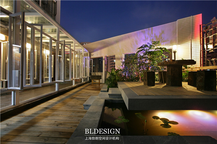
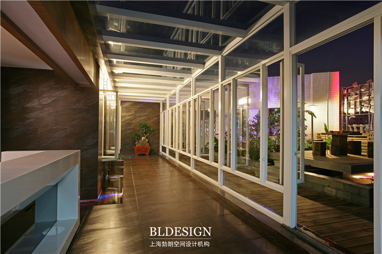
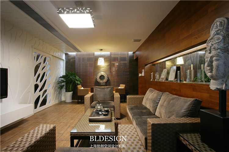
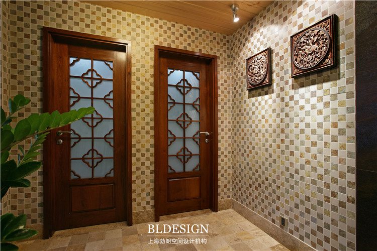
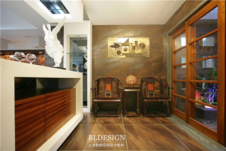
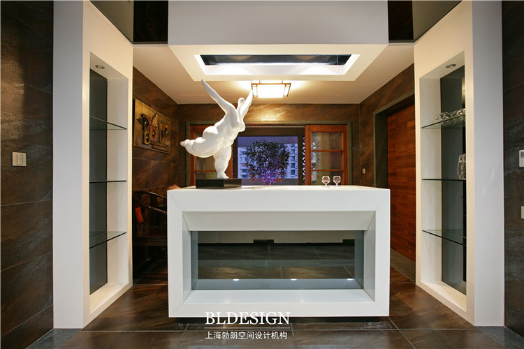
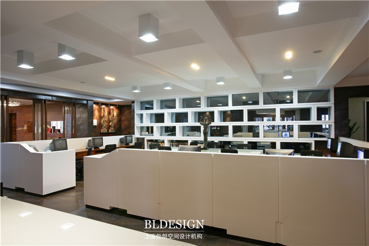
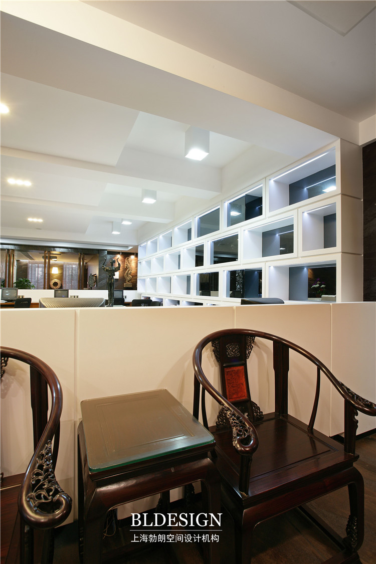
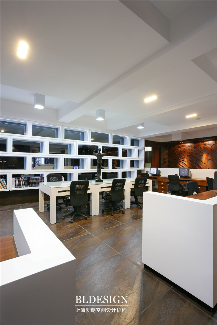
在材质选用方面,运用大量透明材质与木材,结合做间隙,强调空间的通透性,其中接待区及会议室的运用大量透光片材料,将空间的照明系统捏出更多层次变化。从而产生空间的层次感,令整个办公室明亮丰富,更强调了本案企业高档次的企业形象定位。当人们游离其中,随着材质透明度的变化,灯光照明层次变化,也展开了一段领略通透延展或模糊,暧昧的视觉游戏。
In the case of plane design, office design strategy, to function as the main space partition, follow theactivities of the human body for the purpose of streamline, from the entrance, followed by use of the reception area, front office, bedroom, and then to each functional space, so as to highlight thespatial hierarchy in the sense of space, the value of.
On the selection of materials, use of a large number of transparent material and wood, with the space, emphasizing the space permeability, a lot of translucent sheet materials using the reception area and meeting room, the lighting system space to squeeze out more level changes. Thus the level of sense of space, so that the entire office bright rich, more emphasis on the case enterprisehigh-grade corporate image positioning. When people are free of which, along with the change ofmaterial transparency, lighting levels, also launched a taste of transparent extension or vague,ambiguous visual game.
